
Marvel Champions is a game that has absolutely dominated my life of recent, and I felt like I just absolutely had to write something about it. As a huge fan of both Marvel Comics and board games, this card game is everything I have ever hoped and dreamed of. My original intention was to write a long and deep post where I discussed tactics and strategy and advice and all sorts of stuff like that, but having looked online, there is a lot of people a lot better at this game than me doing exactly that, and I don't feel I have all that much to add. Instead, at least for this post, I am going to let the comic-book side of me take the reins and judge cards, not on their efficiency or effectiveness, but on their art.
DISCLAIMER: Obviously all art is subjective and there are no right or wrong answers and if you disagree I would love to hear your opinions. Also I mean absolutely no disrespect and I could not even come close to drawing anything even half as good as any of the cards in this game (also all pictures are taken from hallofheroeslcg.com which is an absolutely excellent site).
Worst Card Art
Honourable Mentions


These are two cards that I actually think look very cool at a glance whilst you are playing the game but on further inspection are a bit odd. Mean Swing looks great until you notice that the position of Thor's arm and the position of the guy he has hit (looks like a dark elf to me) do not make sense. I have been looking at it for a while and I can not figure out what is happening. Thor looks like he is getting ready for a backhand (or backhammer) whilst the guy's face is reacting as if he has already been hit by it. Confusing. God of Thunder looks good until you stare at Thor's neck and realise it looks as if he doesn't have a head, and then you can not stop seeing headless Thor, and then suddenly the card looks incredibly creepy and unnerving.
5th Worst
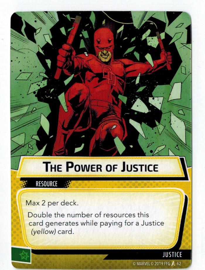
I am a massive Daredevil fan and adore the art work in a lot of his comics, but this one just is not it. For starters, is he jumping forward through a sheet of glass, or is he falling backwards into a dark void? It is impossible to tell. The perspective and texture of the world around him is all wrong, and whilst this would look okay in the magical world of say, Doctor Strange, it looks very bizarre with a traditionally grim and gritty superhero in the picture. Get rid of the weird glass effect and this card would look fine (I presume it is glass, I could be wrong), but currently it looks like Daredevil is tumbling through the mirror dimension.
4th Worst

I enjoyed the art in the Ms Marvel comic quite a lot whilst I was reading it, but in this context it does not work for me. This picture in particular looks like it was a lot smaller (ironically) in the comic than it is on the card, and I also feel it just doesn't match the card's name or ability. This is a card that helps you stop the villain's evil scheme, and yet it looks like a tiny Kamala accidentally being kicked by a civilian wandering by. Compare this card with its twin sister Embiggen!, which does an excellent job at highlighting Kamla's power and size, and this card looks even more disappointing.
3rd Worst

Me and my girlfriend (who was my assistant judge) disagreed on this card quite heavily. She thought it was quite a cool sci-fi picture showing the immense raw power of Captain Marvel, whereas I thought it was an absolute mess where Captain Marvel seems to have three incredibly stubby fingers. Since it is my blog my opinion was the only one that mattered, and I just can not get on board with the look of this card. There's so many different rays and flashes of light, with two vague white beams passing through Captain Marvel's blast as if it isn't there. The more I look at it the more I hate it, and that is not a good thing for a piece of art.
2nd Worst

For the most part Black Panther's card art is some of my favourite, and that is what makes this card so disappointing. Vibranium is supposed to be this incredibly versatile - almost magical material. It's the source of Wakanda's riches, the metal in Captain America's shield, and yet this card art is so unbelievably dull. Maybe I am slightly biased as the card itself is quite dull (in my opinion), but just looking at this card makes me feel sleepy. There is no colour, no movement, no excitement, just nothing that you come to expect from a superhero comic book. I am no artist, but surely they could have added a little something to breathe some life into this card.
The Worst

Whilst some of the other cards on this list were up for debate and difficult to choose, this one was a certainty from the moment I started planning this article. Who else could claim the top spot other than zombie Bucky Barnes? His face is obviously the most upsetting thing, both at a glance and when you stare at it for longer, but there are other problems too. His hair, the weird blocks in the background, even the way he holds his gun is weird. This is a character who was massively anticipated, and a character who's ability means he comes out almost every game, and yet the art is a huge miss. The illustrator actually does some good cards in the rest of Black Widow's set, but this card is effortlessly the worst looking card in the game so far.
Best Card Art
Honourable Mentions
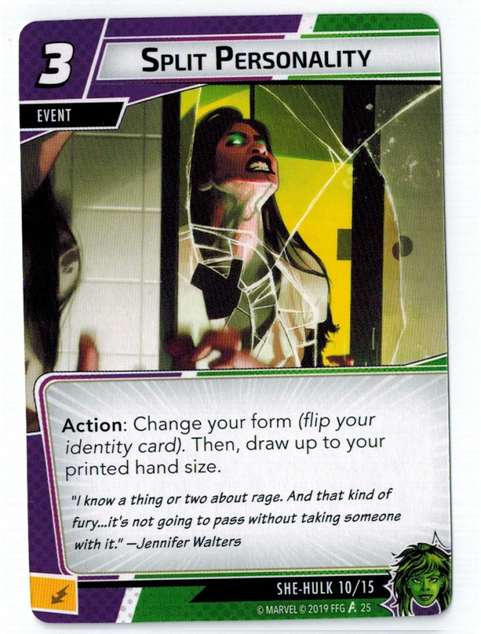
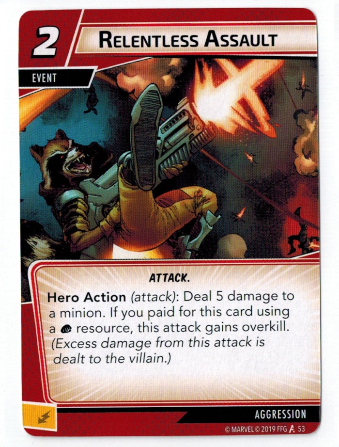
It was hard not to include Split Personality in my top five to be honest. The glowing green eyes, the cracks in the mirror, the huge green veins running through her neck, it perfectly captures the monstrous side of She-Hulk and I love it. If it was not for a somewhat similar She-Hulk card essentially taking this card's place (Spoiler) then it absolutely would have been up there. Relentless Assault is just glorious. Rocket flying backwards whilst firing a gun which is almost the size of him, whilst his face wears a demented grin is the absolute absurdity I want to see when playing as Aggression and I could not write this post without mentioning it.
5th Best

This is one of the aforementioned Black Panther cards that make me love his hero set. Ancestral Knowledge is the card art that perfectly captures the culture of Wakanda. The spread of long lost Wakandan warriors and leaders just in front of the starry night sky is just perfect, and Black Panther's body language really tells a story. The fact the art and theme of the card so perfectly matches the ability is just the cherry on the cake, and whilst I don't play this card as often as I probably should, the card art alone makes me happy for its inclusion in Black Panther's set.

4th Best
I must admit there is potentially a little bit of nostalgia creeping in when it comes to my rating of this card. Something about the art style, potentially the darker shades of red and blue, evokes memories of going to my cousin's and playing hours upon hours of Ultimate Spider-Man on the PS2. Whilst not the only factor which causes this card to rank so highly, any card that takes me back to my Spider-Man themed childhood is sure to be a winner. Another factor that make this card so great is how much of an event it is. It is so fun to play this card, not just to prevent all damage, but because of how great the card art is and how much it makes you feel like Spider-Man. Making someone feel like a superhero purely by playing cards is no easy task, but cards like this are exactly how to do it.

3rd Best
I could pretty much copy and paste the end of the previous description and put it here. Again, this card makes you feel like a superhero when you play it. With a name like Indomitable no way anybody was getting on the front other than Captain America, and you can bet he makes the most of it. Shield held above his head, teeth gritted, glass flying all around him, this is Captain America at his most Captain America. Similar to the previous card, the name, the art, the ability, all work perfectly alongside one another to make this card feel really special when you play it (bonus points if you use this card and then defend for someone else on very low hit points).

2nd Best
This is one of the few pieces of card art I actually recognise from something I have read, and to be fair it doesn't get much more iconic than Spider-Man revealing his secret identity in the original Civil War. That said, I don't think the fact I recognised it had any effect on how it ranked so highly, the card art is just absolutely perfect. A card titled Great Responsibility showing Spider-Man holding his mask in his hands is the stuff dreams are made of. Just staring at the card makes you feel some sort of emotion, you can almost hear the swelling of the music in the background. Originally the card was deemed pretty much useless, but it seems to be undergoing something of a resurgence and I could not be happier. Put this card in every deck, plaster it on every box and poster, sell 3 copies of it in every expansion pack - the art is absolutely perfect.
 You might be wondering after all the praise I heaped upon Great Responsibility how any card could possibly be ranked higher. Well wonder no longer. Gamma Slam is the reason you still play She-Hulk even though a lot of her cards are naff. It single-handedly redeems pretty much all her faults. Whilst it by no means makes her "top-tier", I challenge you to find a moment more satisfying or fun than playing a Gamma Slam for 15 damage. The card art is so different to pretty much everything else in the game so far and it works perfectly. She-Hulk might be fun and smiley and a lawyer, but she is still an absolute monster, and this card reminds you of that. This art reminds you that behind her polite exterior, Jennifer Walters is a terrifying and dangerous woman. This art puts the 'Hulk' in 'She-Hulk'. If you want card art that combines the excitement of Backflip with the emotion of Great Responsibility then Gamma Slam is the card for you.
The Best
Comments
Post a Comment